怎样的图片设计才符合客户的审美?
其实很多卖家是不清楚亚马逊链接的图片该如何设计,也不清楚怎么样的图片更能提高转化率,甚至感觉六张图片太多了没有这么多内容要展示。当然还有写卖家会去抄袭竞品的图片稍微修改就上架了。那到底怎样的图片设计才符合客户的审美,才能真正提高转化率呢?
一.像优秀的卖家学习
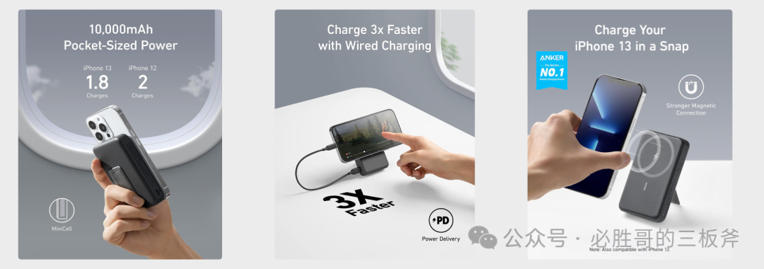
我个人就很喜欢去参考Anker的图片设计,是不是听到这里会觉得不可思议。Anker高高在上,我等小卖家如何可以高攀。其实不然,又不是让你做充电宝跟Anker去竞争。因为anker这类大卖的资源是我们无法比拟的,他们的图片设计背后可能有很多大数据模型作为支撑,或者至少设计团队花费的金额很高。那学习anker,模仿anker可以以最低廉的成本获得最高的收益。
如下是参考Anker的图片设计,得出的� �些结论。
- Anker的产品图片具有强烈的科技感和简约明了的风格,这使得其产品在视觉上非常吸引人。这种高质量的视觉效果能够提升产品的吸引力,还能有效传递品牌的科技感和专业性。
- 使用高像素的主图和副图来展示产品的细节和全貌,从而提高用户的购买欲望。像素为1200*1500,其目的是适配亚马逊APP,让产品图片在亚马逊APP上展示为全屏,没有上下留白。
- Anker的图片设计注重用户体验,提现卖点。所有图片以实际造型展示产品的卖点和使用场景,文字占比非常少。
二.如何设计产品图片
其实亚马逊图片设计是有模版的,一般是主图+功能拆解� �+卖点展示图(1到2张)+痛点解决图+使用场景图+主图视频。产品的类目也许不一样,但是构图是基本不会变的。
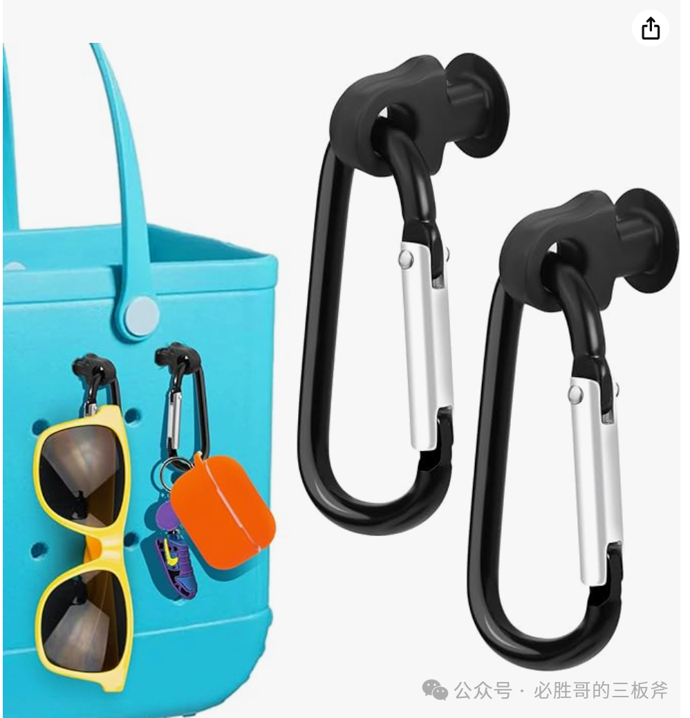
下面对某个类目第一名的产品进行拆解。
Bogg Bag 产品链接
https://www.amazon.com/gp/product/B0C6LNXXPG背景介绍:Bogg Bag是一款设计独特、功能多样的沙滩包,其设计灵感来源于Crocs凉鞋的可注射泡沫材料。这款包的创始人Kim Vaccarella和她的家人非常喜欢海滩,但他们发现市场上缺乏一款既能满足大容量需求、又不易倾倒且易于清洗的沙滩包。在多年的寻找未果后,Vaccarella与她的丈夫决定自己创造这样一款包。这款包中文也可以称为洞洞包或者沙滩包,而这个产品就是沙滩包的配件,简称沙滩包钥匙扣。
主图。虽然是沙滩包的配件,实际是比较小的。但是不能被沙滩包抢戏,所以沙滩包钥匙扣在图片的占比超� �60%,视觉上客户会以产品本身为主。另外左侧展示了沙滩包钥匙扣的使用效果,提高产品的点击率。
卖点图。
- Attaches securely Perfect fit!
- Easy to find keychain charms
- Compatible with all bogg bags and simple southern
卖家只有深入了解到了产品的优点、卖点、痛点在哪里,才能把这些内容转化为文字,最后转化成图片去打动消费者。

No comments:
Post a Comment